Case Study | End to End
Fitme
A Better Way to Exercise–Application
Starting, supplementing, or changing a fitness routine can be complicated.
Imagine the last time you thought about joining a gym or picking up a new sport, only to be overwhelmed by where to begin or fear of not fitting in. This common dilemma leads many to abandon their fitness aspirations before even starting. Enter Fitme, an innovative application designed to dissolve these barriers by matching users with activities that align with their lifestyles, goals, and personal interests.

Project Overview
My Role
Product Designer | UI/UX Designer
Tools
Figma | Maze | Marvel
Timeline
3 months
Research & Planning
My research began with a hypothesis centered around "gymtimidation" and its impact on exercise avoidance
A survey of 24 participants and interviews with 6 individuals revealed that the primary obstacle was not fear but a lack of motivation and understanding of where to start. Insights gained were pivotal in shaping Fitme's direction, highlighting the need for a tool that matches users with activities and empowers them with resources and community support.
The design process was driven by the goal to make exercise a personalized, engaging, and less daunting experience
This led to the development of features such as a criteria-matching test, a comprehensive resources page, and community connections to inspire and support users in trying new activities.
An examination of direct and indirect competitors, including MyFitness Pal and Nike Training Club, provided insights into industry standards and user expectations
These findings informed the design of an application that stands out not just for its functionality but also for its user-friendly and motivating experience.

MyFitness Pal
Takeaway: various resources beyond just diet tracking
Nike Training Club
Takeaway: easier to navigate than MFP. Varied content that caters to a wide experience level
Career Explorer
Takeaway: helps people find a niche in various industries. A user doesn’t need to have prior knowledge to execute this test effectively. The interface is clean, easy to navigate, and organizes results from most to least likely careers a user aligns with given their answers
16 Personalities
Takeaway: matches people to personalities that coincide with their responses and supplies resources that can help them understand this finding
I used the information I learned from my survey and interviews to create an affinity map
This step allowed me to plainly lay out my main insights that I could transfer over to a persona.
Since my users ranged from experienced to inexperienced with exercise, I created a pimary persona for someone in the middle
Jane Doe became my primary persona. Focusing my design efforts on the “middleman” ensured I would create a flow that appealed to a broad spectrum of individuals.
Site Map
To visualize the pages my app would have I created a site map. Creating the site map helped me identify my red routes, and thus streamlined the design process.
User Flow
My user flow isolated the screens I would design by helping me visualize the main paths a user would take to accomplish the main functions of the app
Early Sketches
I took various ideas used by my competitors for better usability. I leaned heavily on career explorer’s format for Fitme’s test and results pages.
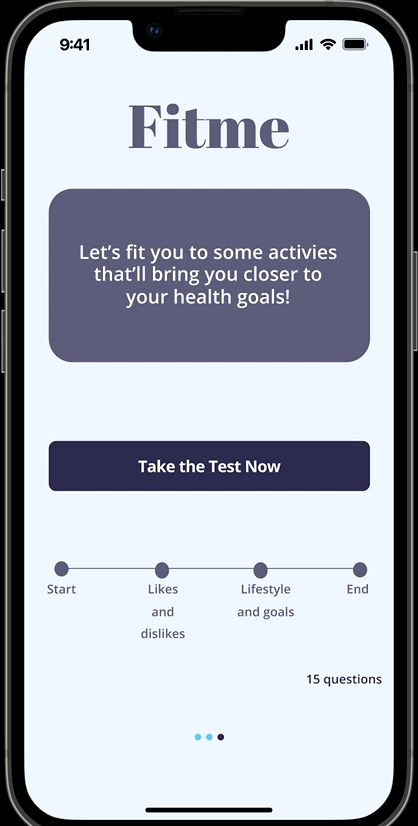
Criteria test to results flow
Sign up to Onboarding
Login to homepage
Profile
Results page
Login pages
Guerrilla Testing
Centered around our primary persona, "Jane Doe," the design process focused on creating an intuitive user experience from the onboarding process to the exploration of activities. Guerrilla testing on early prototypes helped refine the design, addressing user feedback on navigation and content presentation.
“Take the test then sign up” screens
After testing these screens on 5 individuals, I uncovered a few minor issues that I would need to alleviate during my high fidelity prototyping phase:
Copy improvements | Improve test to results flow | Profile information hierarchy needs adjusting |
Why this design?
My research revealed that people wish they could supplement their workout routine with another activity to break up the monotony.
The reason they wouldn’t add a new activity was out of fear that it wouldn’t help them reach their goals, it took too much time to research, or they didn't know where to begin. By matching individuals to activities and providing resources, locations, and articles about different sports and exercise styles (like HIIT), this design can address all their main concerns.
High Fidelity
After creating the low fidelity screens I designed high fidelity screens.
Color Scheme & Its Psychology
I chose shades of blue because I felt that color aligned best with the brand virtues of happy, tranquil, inviting, simple, and trustworthy.
I used a mix of photography and illustrations throughout the app
The illustrations gave the interface a modern, fun, and happy feel while the photography was used to aid in the brand’s trustworthiness. The illustrations were restricted to the background whereas the photography pictures showed different sports, movements, and article images.
I chose to use open icons to give the interface a clean and simple feel.
Screens
The final design phase brought Fitme to life with a color scheme that embodies tranquility and trust, a mix of photography and illustrations to engage users, and streamlined user flows to facilitate easy exploration of activities and resources.
I took my high fidelity designs and made them into a prototype to test amongst a total of 10 individuals
Evolution of the test
Luckily, many of the changes were minor and required slight tweaks
During each test, two main themes arose amongst testers: they would either request features be added, or critique the research design.
To ameliorate these problems, I would concede to feature requests that made sense (adding an “allow location” feature for the map) and I tweaked the flow of the prototype.
I used Maze to ensure that the edits I made to my designs were data driven
My heat maps generated through Maze showed the screens with the most misclicks and let me know when users selected the right option
Test to sign up process
Results to “get started,” where users can find resources to help begin a new activity
View the Figma prototype
My program required only three iterations for this project, so I strive to ensure each iteration had meaningful data-backed changes
Despite only working through changes three times, I thought about ways to continue improving the app:
Improve the copy throughout the app
Integrate better accessibility in colors and content (screen-reader and voice to text friendly).
Improve the “fun” aspect of the interface through the use of interesting font, animations, and illustrations
I would consider narrowing the scope even more on my application and maybe limiting it to just matching people with outdoor or indoor sports
Revamp the homepage to look more modern by varying the manner the articles are displayed–consider a horizontal option for some topics.
Concluding Thoughts and Lessons Learned
My greatest challenge was the learning curve
Being my first (ever) design project, I had to develop a Figma proficiency quickly and learn how to properly use various UX methods. Despite having to develop a decent UI/UX prowess in a short timeframe, I was able to apply what I learned immediately, which (hopefully) makes those lessons stick more in my long-term memory.