Case Study | Industry Design Project
Total Wellness+
Improving a Small Business’s Landing Page
Goal
Our team aimed to build a landing page that highlights the benefits of the products and programs offered, funnels clients to sign-up for consultation, and purchase a comprehensive individualized plan
Total Wellness+ started from Austin’s desire to help educate people about the benefits of pairing functional medicine with a healthy lifestyle. During Covid, the world saw an increase in consumers’ comfort level with online shopping. This allowed Austin to launch his idea through an online e-commerce website that would pair those seeking to address their health needs with his team of health professionals.
Project Overview
My Role
UI/UX Designer | Copywriter
Tools
Figma | Photoshop | Unsplash | Google Docs
Timeline
6 weeks
Constraints
No budget | Design for landing page only

Gaining Insights on the Project Scope
We interviewed our main stakeholder, Austin, to learn more about his brand, his vision, and gather project-relevant information
Research & Planning
As we began, Austin’s desired user behavior was clear. “So ideally, everyone who ends up on our website is scheduling a consultation”. He explained a two-dimensional lead-generating model: 1. Scheduling a virtual consultation with a health expert 2. Completing a Health and Lifestyle questionnaire.


Finding Our Users
It quickly became clear that Austin wanted to appeal to everyone, so we diligently researched the types of people who would be interested in his company’s services
Our design had to be accessible to a wide demographic. With this in mind, we created user personas around two archetypes: (1) those remedying health issues + (2) those maintaining/improving health


Understanding the Market Landscape
We looked at other brands that appeal to a similar market to learn what to include on our site and what to avoid
JMarieFitness/01
Jmariefitness presented a trustworthy website with an aesthetic design. She did well at creating a site with intuitive usability and she also had solid value propositions.
Promix/02
Promix presented a trustworthy website with an aesthetic design and functional usability, however, their value propositions could be improved.
Standard Process/03
Despite appearing trustworthy and having a modern aesthetic design, Standard Process lagged behind the other competitors with their usability and value proposition. The menu that overlaid the video header was hard to read and confusing to use.
Prose/04
Prose appeals to a large audience who are interested in customizable care, much like Austin’s company provides. Their site appears trustworthy, has an aesthetic design, and great proposition values. Their usability, however, is okay.
We focused our research on the competitors
Robust UX research would have been too costly for the client, so he opted for this limited approach. In fact, he did not want UX involved at all, but our team carried out a competitor analysis to at least ensure we were following trends to create a functional landing page.
Creating Uniformity Across the Site
Brand Identity
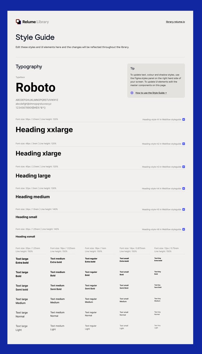
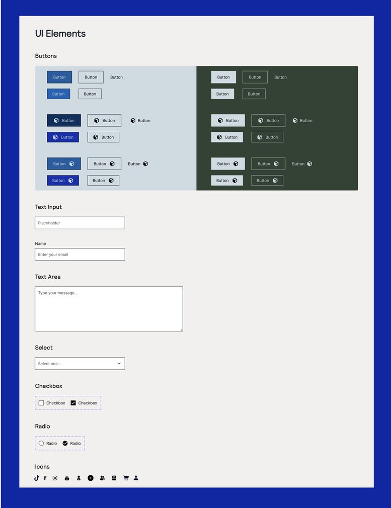
Our team decided to use the Relume library for its robust style guide and template library. Since Relume is a wireframe kit, we implemented our iconography, colors, and CTA button colors onto the style guide.

Catering the Colors to the Company’s Personality
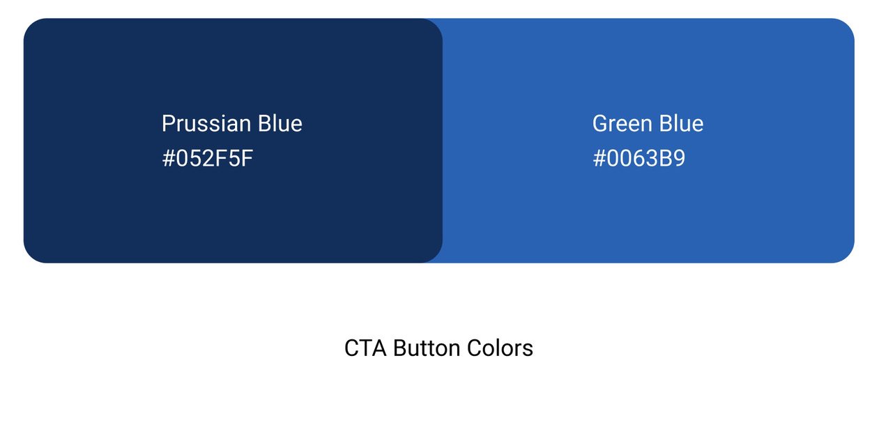
We chose the background colors (beau blue, ash gray, and kombu green) based off the client’s preferences and brand identity.
The brand is supposed to invoke a clean lifestyle (green inspiration) and imbue a sense of professionalism, brand legitimacy, and trustworthiness onto users of the website (blue inspiration). The CTA buttons are different tones and shades of the company color: Blue Pantone (#0123A2)
Designing the Solution
Generating Ideas
Our team did crazy 8’s for different aspects of the landing page
One team member did her crazy 8’s on different homepage layouts
Another team member focused on the nav bar layout
Another team member focused on the hero header
I did only the landing page, and did not illustrate each section quick enough, so I only managed to get one draft down of the entire landing page
Iterating and Refining Our Sketches
Implementing our favorite aspects from the sketches, each member independently wireframed how they thought the landing page should look
As you can see from the image to the right, we ended up having conflicting ideas how the landing page should look and what the copy should say.
We then reviewed our client notes again and spoke with the client regarding which designs he favored.
High Fidelity Wireframes
With his feedback, we then moved on to designing the high fidelity mockup of the landing page
We ran through three different iterations. Each one we tweaked the copy to ensure the company’s goals and direction were clear.
The client liked the hook, “Better health, Better You,” so I continued to tweak the tagline to better illustrate the company’s purpose.
I wanted to shift the focus away from the company and put the attention on the client by showing what they and TW+ have in common–they’re both unique.
The client was adamant that his company wasn’t supplement based, so I turned that into a slogan. He didn’t like the first two headlines because they didn’t explain what they were. The final iteration includes a better image of what the brand is about.
Close-up on some of the screens
View the prototype here

If only we had more time and a larger budget
Concluding Thoughts
After our team concluded the project, those became our famous last words-our final product could be greater “if only X.”
Due to time constraints and lack of provided resources, we did not get actual product shots that could be featured on the homepage. The shots we did include, I had to photoshop other brands out of them.
By adding product shots, customers and users would be able to get more information about the available products as well as a better visual idea of what the company provides.
“Why say more word when few word do trick?” - Kevin, from the Office
Kevin had a point. Maybe not for everyday conversation, but when it comes to writing copy, his words are a rule to follow–less is more.
I found it challenging to sum up an entire brand in a few punchy lines, but, I feel satisfied with what the end result became.
It’s important to note that this project was the first time I got to work with a team. Compromise and creating a safe space to share ideas was important to all of us, and it allowed for better collaboration over all.
The team consisted of 5 individuals, 4 of which have only been designing for a few months. Our team leader is a mid level UI/UX designer for Kroger. Without his guidance, there would have been a lot more fumbling.
Overall, we accomplished our task and made our client, Austin, happy.
