Case Study | Industry Design Project
OC-Detect
Designing a Telemedicine App and Doctor Portal
We sought to create wireframes for a mobile and web-based product aimed at enhancing oral cancer detection services
The project had four stakeholders: the company owners (2), project director, & researcher.
Project Overview
My Role
-I was one of three designers
-UI designer for web and mobile products
The Problem
Tools
-Figma
Constraints
-NDA
-Short timeline
-No Dev team
So, we saw an opportunity to build an app with an innovative awareness-building approach and appealing incentives by involving monetary compensation to those who use the app
The Researcher on the Project Identified Two Main Users
So, my team and I collaborated on creating two personas: student for the mobile product and a clinician for the web based product. This step helped us create user-centered designs.
The Current Solution Relied on People to Wait in Line All Day to be Screened for Oral Cancer
This not only eats up time, but standing in line takes a toll on the body. The head researcher discovered many people skip their appointments for this reason.
To Brainstorm Some Solutions We Created “How Might We” Statements
How might we utilize telemedicine screener techniques to ease the time burden that the current solution imposes?
How might we leverage interactive and informative visuals to communicate the importance of oral cancer screenings in an easily understandable manner?
How might we collaborate with local healthcare providers to establish a seamless connection between the screening solution and follow-up medical procedures?
Timeline
-5 weeks
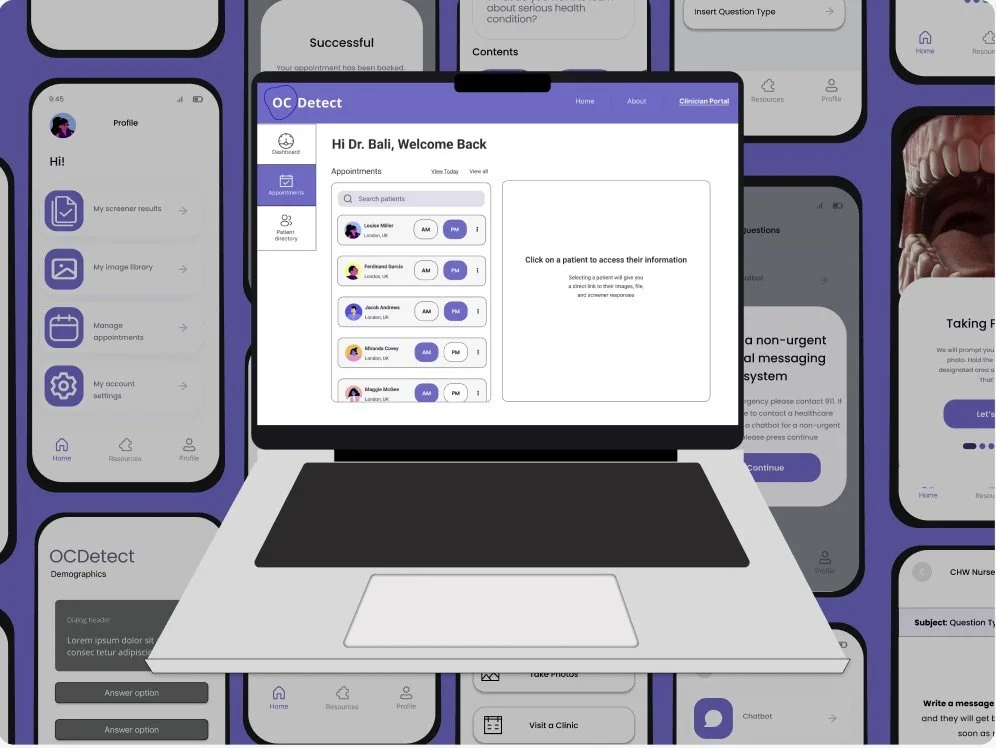
A streamlined web platform that allows for quick viewing of patient images and files
The researcher conducted two separate surveys: one on the healthcare provider and another on students
Below, I’ve highlighted some data that my team and I leveraged for our designs.
Healthcare Provider Survey
70%
of respondents believed family members could use a mobile app to screen family members for health conditions
50%
of respondents have not been given health condition prevention materials or resources with their patients
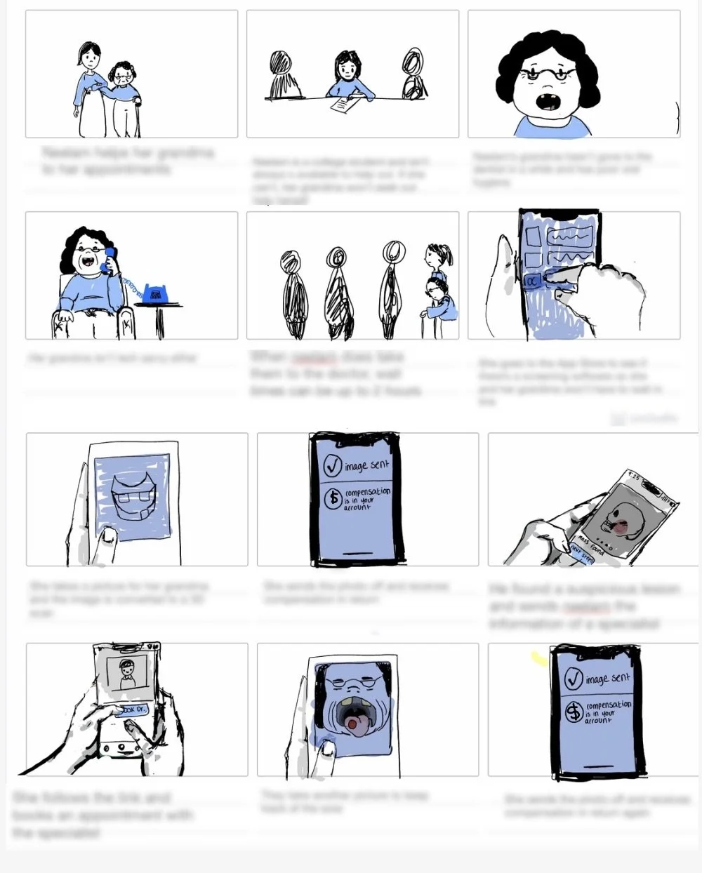
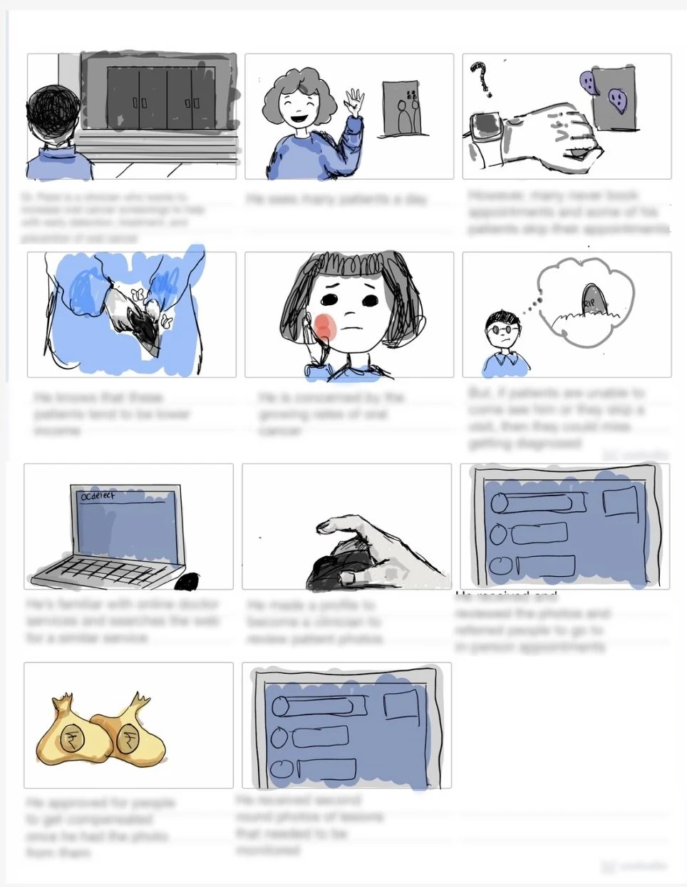
We then sought to uncover the process people would use our app and website
This step proved critical at ensuring my team and I as well as the stakeholders were on the same page. By storyboarding, we were able to identify the circumstances the app & website would be used and cleared up confusion around the transfer of funds process.
Student View
To adhere to the NDA, I’ve blurred out the text to maintain privacy
After generating a broad picture for the interaction between mobile and web platforms, we turned our attention to competitors.
Although we had a general idea, comprehending the finer intricacies of each platform remained unclear. Prior to delving into the user flows, our priority was to examine how other applications and websites addressed a comparable niche.
Mobile Competitors
Scanoma
Easy and straightforward onboarding. Ample information on the condition
Takeaway: Simple nav menu, access to resources, and straightforward onboarding
Aysa
More similar to the stakeholder’s vision. Allows for several profiles to be created. However, the mobile OC-Detect app would’t be allowed to diagnose.
Takeaway: Multiple profiles, Need verification method to determine if photo is of good quality, Better resource layout
Web Competitors
Baptist Health
Although this portal is for a patient, the content and layout proved useful in generating ideas for what a doctor would need to see
Takeaway: Maximize page space and focus on deep navigation
Dribbble Example
We liked the navigational menu included on this example, but we knew our needs were more minimal than this page.
Takeaway: Varied layout
ADPlist Messaging
We liked the messaging format of ADPlist and wanted to incoporate a similar layout for the doctor portal.
Takeaway: Simple messaging layout

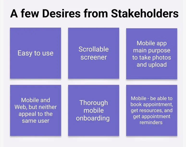
Product Desires

Student Survey
39%
39%
17%
of respondents believed that there’s a lack of awareness around oral cancer
of respondents received information about oral cancer from dentists, doctors, or physicians
of respondents have used an app to screen for a health issue
Clinician View
Objectives
User Objectives

To have a shorter screening process, especially if they are helping an elderly relative go through the screening procedure
Business Objectives

Create a product that satisfies their contractor’s needs to decrease oral cancer by raising awareness and increase cancer screening conversions
How We Measured Success

Creating iterative designs, focusing on heuristics, stakeholder feedback, and contextual inquiry validated the success of our designs
Research
Before diving into design, I crafted a site map and user flow to streamline architecture, preventing the creation of unnecessary screens
This phase entailed robust stakeholder collaboration to dispel process misconceptions.
Clinician Desktop Experience
Student Mobile Experience
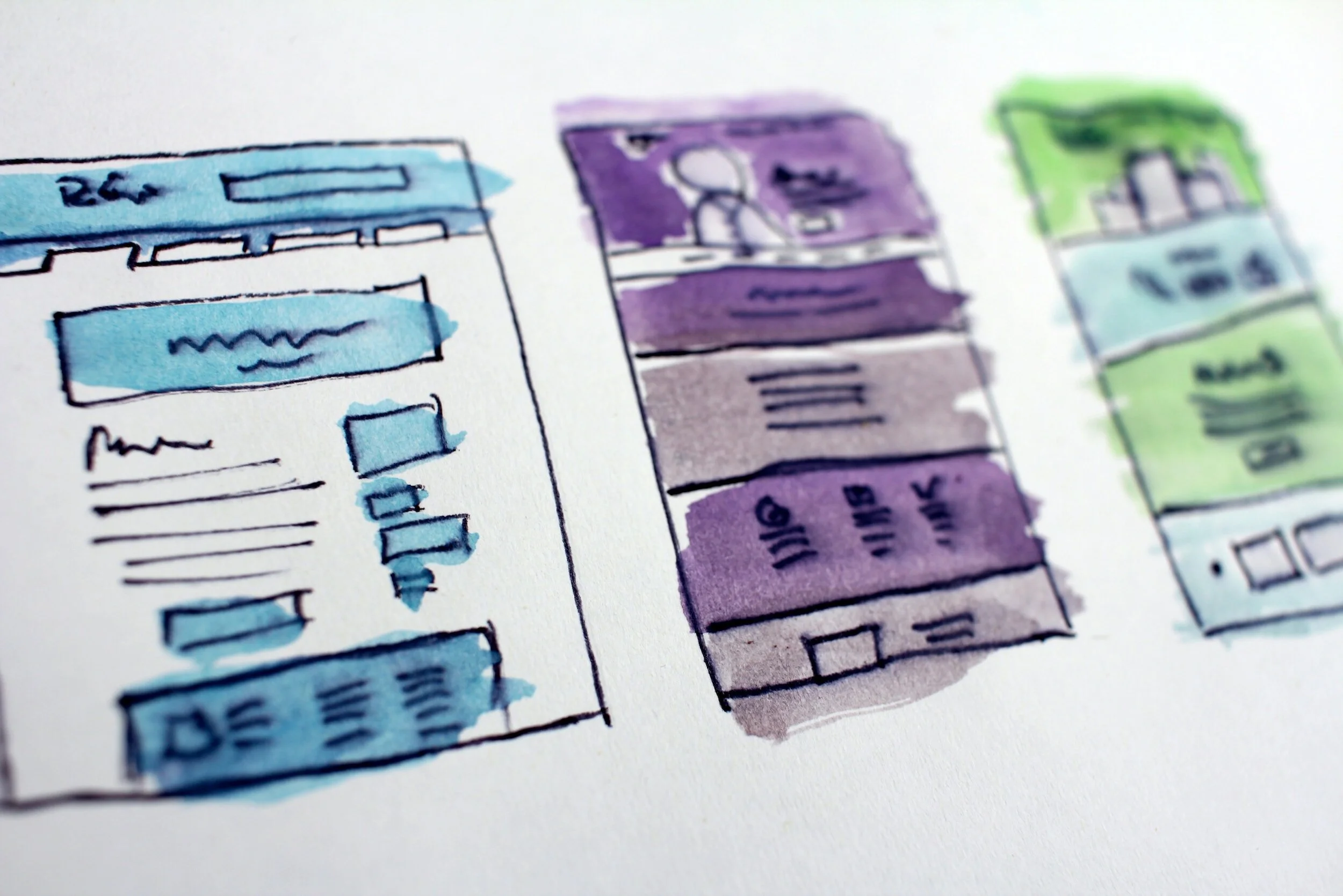
Finally, we were ready to get our ideas down
We started with the big screens and built our flows from there, totaling to about 4 separate iterations.
Each round we either added entire flows or significantly edited our screens. The changing needs of the stakeholders and our expanding understanding of how to address the problem better prodded us to keep going back and tweak the designs we had.
Design Evolutions for Our Web and Mobile Products
Evolution of the home screen
High fidelity screens were never apart of our deliverables
I brought our low fidelity designs to high fidelity for the purposes of visualizing the potential of the website.
For quick access, the clinician would be able to go straight to patient images from the directory
The stakeholders noted that this stage was the most important–photo reviewal.
Designing the Solution

Although my team didn’t get to ship the product, we made our stakeholders happy
Concluding Thoughts
At the end of our project, our stakeholders were satisfied with our deliverables. We made sure to document every part of the design process, focusing on labeling all of our components and ensuring the designs could be handed off to another team without any difficulty.
Nagging Concerns
Needs to be Tested
The project ended on a cliffhanger. We reached a point with our wireframes that we exhausted stakeholder advice and research and we needed to test out the screens to identify problem spots. Except, we were never meant to test the product and our timeline expired, so we had to wrap up our role in the project instead.
Designing for the Wrong Audience
My biggest concern is that we designed an app for an American audience and not the country it was designed for. I would love to test out the functions of our application and website to identify problem areas that don’t meet user expectations and complicate the process.
Lessons Learned
Ask More Questions & if the Stakeholder can’t Visualize Your Problem, Show Them Through Design
Especially when you are not close to the user and designing for a foreign market, asking stakeholders–who have ruminated on the problem for much longer than we have–questions will help smooth out any road bumps that pop up along the way. When they can’t visualize what the confusion is, design it. If it’s a flow question, prototype it or refer to the user flow.
Refocus Stakeholders by Asking Them, “What is the Problem That We are Trying to Solve?”
It’s hard for a designer to stay in the problem space and even more difficult for stakeholders who have been zeroed into the problem for months. They are ready to see designs and their imaginings brought to life. However, they aren’t designers and don’t know why we choose to organize information the way we do, so circling back on the problem we are trying to solve can dissolve conflicts and “butting heads” with diverging desires.